
Sergey S. @sergey@social.ssbx.dev
Joined Nov 2020
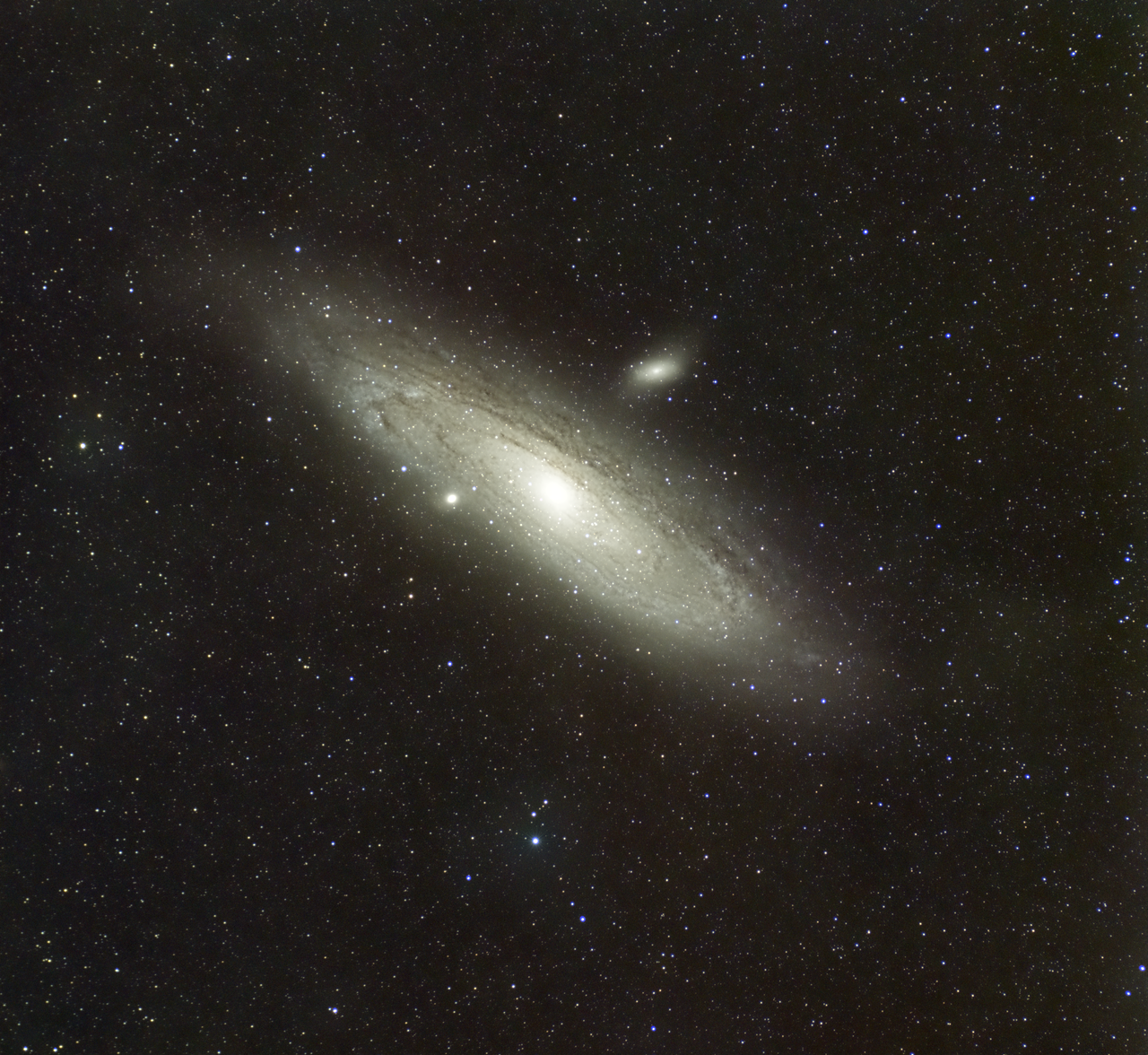
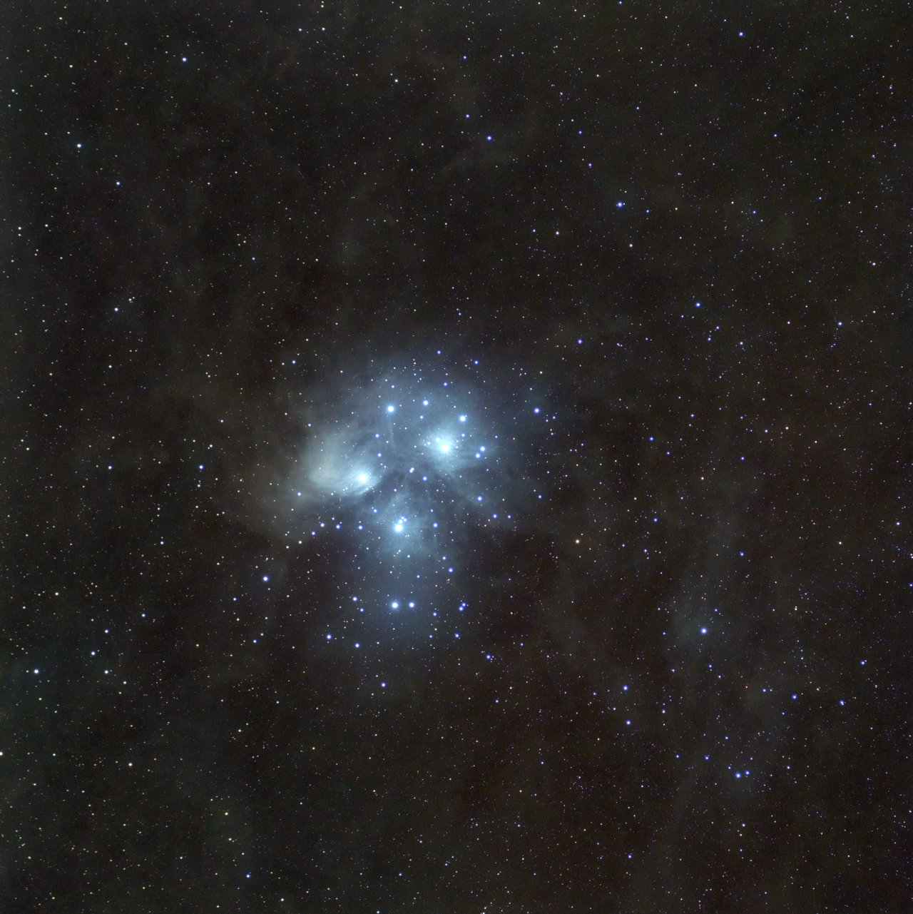
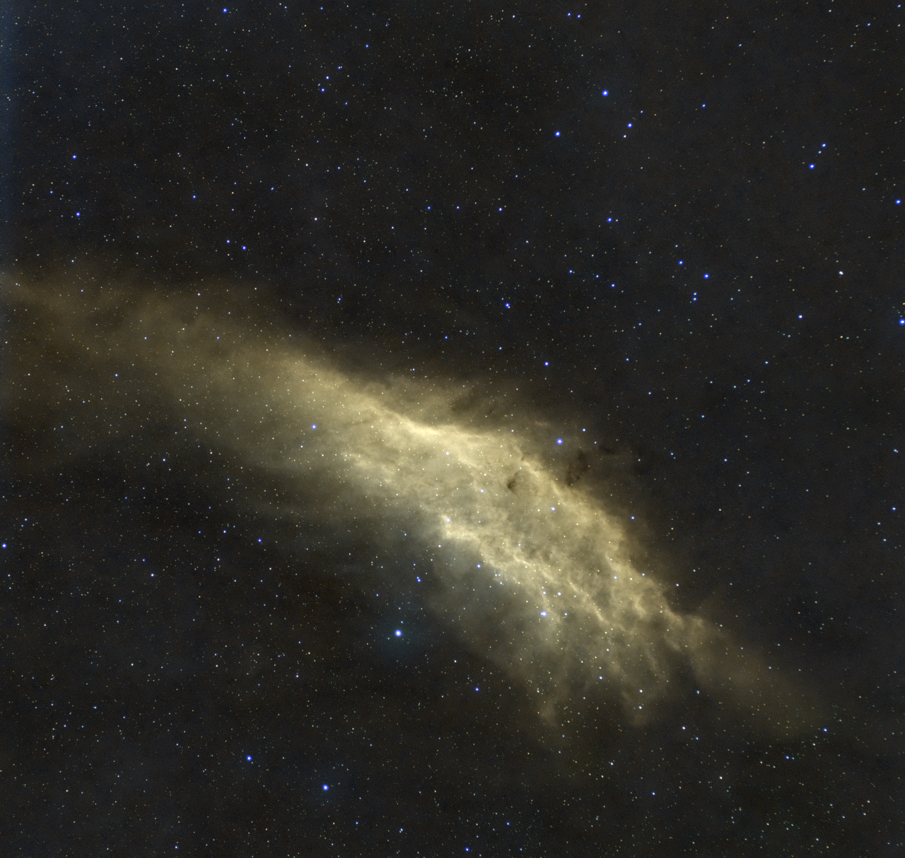
It's been a while so this is my Fall offload, Andromeda and Pleiades, both around 12-14 hours. California Nebula from last year in SHO, that I had finally processes. #astropic
@XF9 While it may stand out bit more and create perception that there are more details, I personally prefer image on the right, as yellow color on the left looks weird to my taste, but that's personal preference. The difference of colors bringing viewer on to those details that's why perception that you get more details is there, amount is possibly the same but it's hard to distinguish red from pink compared to red from yellow.
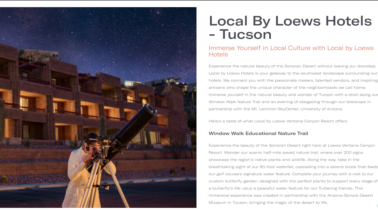
This is way too wrong not to share, Loews Hotels in AZ have quite interesting picture describing local programs :D where girl appears to be looking at the telescope? Can you find what's wrong with this picture? ... This is Newtonian which has mirror at the bottom, and front of this scope pointing to the ground :D no wonder she is so frustrated.
